

How to control dark mode in React Native using Redux?

This tutorial aims to show the use of the Redux mechanism to toggle the dark mode on React Native applications. The idea is to add dark mode configurations to React Navigation as well as components from the React Native Paper library.
Redux is a powerful and popular state management mechanism.
You will be able to apply the dark mode theme configurations to each page and UI elements in your app by accessing the central Redux store. The process will implement dark mode in any React Native application very conveniently and efficiently.
For this tutorial, we will bypass the installation process of any package. As we are using the Expo ecosystem which automatically installs the package for us.
Before we start
You can check the actual demo of what we are going to implement in the Expo platform itself. No need to worry about setting anything up, you can run the app on the simulators provided by the Expo platform.
Prerequisites
The knowledge that would be helpful before you begin.
Here is a list of helpful topics (basic knowledge) to better help you get started with this tutorial:
Have a basic understanding of Snack - an online React Native IDE.
STEP 1: Setup simple screens with the React Native paper
Our first step is to set up simple screens using the components from the react-native-paper UI library.
To do this, we need to create a directory named ./screens and inside the directory, we need to create two new files called Home.js and Setting.js.
In the Home.js file, we need to import the components from the react-native-paper package as directed in the code snippet below:
import {
    Avatar,
    Button,
    Card,
    Title,
    Paragraph,
    List,
    Headline,
  } from 'react-native-paper';
Next, we are going to add the card layout to the screen using the Card component as shown in the code snippet below:
const Home = () => {
   return (
       <View>
            <Headline style={{ marginLeft: 23 }}>Lastest Post</Headline>
           <Card
               style={{
                   shadowOffset: { width: 5, height: 5 },
                   width: '90%',
                   borderRadius: 12,
                   alignSelf: 'center',
                   marginBottom: 10,
               }}>
               <Card.Content>
                   <Title>Blog post</Title>
                   <Card.Cover
                       style={{
                           width: '100%',
                           height: 190,
                           alignSelf: 'center',
                       }}
                       source={{
                           uri:
                               'https://images.unsplash.com/photo-1573921470445-8d99c48c879f?ixlib=rb-1.2.1&ixid=eyJhcHBfaWQiOjEyMDd9&auto=format&fit=crop&w=1050&q=80',
                       }}
                   />
                   <Paragraph>What is Lorem Ipsum?
Lorem Ipsum is simply dummy text of the printing and typesetting industry. Lorem Ipsum has been the industry's standard dummy text ever since the 1500s, when an unknown printer took a galley of type and scrambled it to make a type specimen book. It has survived not only five centuries, but also the leap into electronic typesetting, remaining essentially unchanged.
i</Paragraph>
               </Card.Content>
           </Card>

       </View>
   )
}
export default Home
Here, we have used the Headline component to display the title. To create a card like component in the UI, we used the Card component with its subsidiary modules. Inside the Navigation.js file, we need to import the React Navigation components, NavigationContainer and createBottomTabNavigator.
We should get the results displayed in the emulator screenshot below:

Next, we are going to implement the Setting screen. The Settings screen will be simple as it will only have a 'toggle component', that will allow us to toggle the theme modes within the app.
In the Setting.js file, we need to add the code for the Switch component to be able to toggle over to a dark theme.
The code for this is provided in the code snippet below:
import React from 'react';
import { View, TouchableOpacity } from 'react-native';
import {
   List, Switch,
} from 'react-native-paper';
export default  ({ navigation }) => {

    return (

        <View style={{ flex: 1 }}>
            <List.Item
                title="Dark Mode"
                left={() => <List.Icon icon="brightness-4" />}
                right={() => <Switch />}
            />
        </View>
    )
}
We should see the result as they are displayed in the emulator screenshot below:

Here, we have added an icon as well as a switch component on the right. We are now done with the UI part of the tutorial. We can move on to the functionalities.
STEP 2: Setting up React Navigation
To set up the React Navigation, we need to re-structure our app a bit. First, we need to create a new file called Navigation.js at the root level that will contain the code configured for navigation purposes.
Inside the Navigation.js file, we need to import the same React Navigation components. They are NavigationContainer and createBottomTabNavigator. We also need to import Home.js and Setting.js components which are screens that we need to navigate to.
The imports are shown in the code snippet below:
import * as React from 'react';
import { NavigationContainer  } from '@react-navigation/native'
import { createBottomTabNavigator } from '@react-navigation/bottom-tabs';

import HomeScreen from './screens/Home';
import SettingScreen from './screens/Setting';
Here, we have used two navigations packages:
- react-navigation/native: It's the core react-navigation package.
- react-navigation/bottom-tabs: This package provides components to implement the bottom tab bar.
Next, we need to initialize the navigation structure using the NavigationContainer component. We used it along with the Tab components as directed in the code snippet below:
export default () => {
    const Tab = createBottomTabNavigator();
    return (
        <NavigationContainer >
            <Tab.Navigator >
                <Tab.Screen name="Home" component={HomeScreen} />
                <Tab.Screen name="Settings" component={SettingScreen } />
            </Tab.Navigator>
        </NavigationContainer>
    );
 }
Then, we need to import the Navigation component into the App.js file and initialize it inside the render function as shown in the code snippet below:
import Navigation from './Navigation'
export default function App() {
  return (
    <>
     <Navigation/>
   </>

  );
}
As a result, we will get the tab navigation bar at the bottom of the screen that we can use to navigate to different screens as shown in the demo below:

Our next step will be to add icons onto the tab bar items to make it look more appealing.
Adding an Icon to the Tab bar
Here, in the Navigation.js file, we're going to add some icons to the tabs in the tab bar. To do that, we need to import some icons as demonstrated in the code snippet below:
import {MaterialCommunityIcons} from '@expo/vector-icons';
Next, we need to add the screenOption to the Tab.Navigator component using the logic we added to the toggle icon style when tabs are active or inactive. The code for this is provided in the code snippet below:
<Tab.Navigator screenOptions={({ route }) => ({

               tabBarIcon: ({ focused, color, size }) => {
                   let iconName;

                   if (route.name === 'Home') {
                       iconName = focused ? 'home' : 'home-outline';
                   } else if (route.name === 'Settings') {
                       iconName = focused ? 'settings' : 'settings-box';
                   }
                   return (
                       <MaterialCommunityIcons
                           name={iconName}
                           size={size}
                           color={color}
                       />
                   );
               },
           })} >
We will get the result demonstrated in the demo below:
As we can see, we've got the icons in our tabs and they display active as well as inactive states. Now, we move on to our main objective, implementing the dark mode theme.
STEP 3: Manual Dark mode
Here, in the Navigation.js file, we're going to implement the controls to change the app theme to dark mode manually.
First, we need to import the components from the react-navigation and react-native-paper packages. These components will help us control the dark theme. We need to import the respective components from the packages in the Navigation.js file.
An example code snippet is shown below:
import {
    NavigationContainer ,
    DefaultTheme,
    DarkTheme } from '@react-navigation/native'
    import {
        Provider as PaperProvider,
        DefaultTheme as PaperDefaultTheme,
        DarkTheme as PaperDarkTheme,
     } from 'react-native-paper';
Next, we need to assign the theme prop to the NavigationContainer component with the DarkTheme option provided.
Then, we need to wrap the component inside the NavigationContainer component with the PaperProvider component.
Lastly, we need to provide the PaperDarkTheme option as a theme prop to the component.
The configuration is provided in the code snippet below:
<NavigationContainer theme={DarkTheme}>
              <PaperProvider theme={PaperDarkTheme}>
We'll notice that the entire app UI has changed to a dark theme, as we can see displayed in the following emulator screenshots:
Here, we have given the user(s) the option to change to a dark theme using the components from the navigation and paper packages. Now, we need to add controls to it. We're going to do that by using the Redux mechanism.
STEP 4: Setup Redux
In this step, we're going to integrate the Redux mechanism to control the dark mode theme toggle from the Switch. The idea is to control the dark mode theme from the switch located in the child component that reflects the parent component. First, we need to create the Redux structure that holds the overall Redux code.
We'll do that by creating a folder named ./redux at the root level of the project. Then inside the root redux folder, we need to create two folders named ./reducers and ./actions:
reducersto contain the reducer files that handle the state manipulation.actionsto contain the function that we extracted from the components.constant.jsfile to hold all the state names.
Now, we need to define the required state names in the constant.js file. In this project, we will have two states, one for the light theme and one for the dark theme.
Both are defined in the code snippet below:
export const DARK_THEME = "DARK_THEME";
export const LIGHT_THEME = "LIGHT_THEME";
Next in the ./reducers folder, we need to create two new files named theme.reducer.js and index.reducer.js. First, we will implement the theme.reducer.js file.
In the theme.reducer.js file, we need to import the state names from constant.js. Then, we need to define the initial state called theme that will help control the theme modes.
Here, the theme state will be set to false in order to set the light theme as the default theme. Then we need to create a function to toggle the theme state using a reducer function.
In the reducer function, we use the Switch case logic to modify the theme state based on action type. The code for this is provided in the code snippet below:
import {
    DARK_THEME,LIGHT_THEME
} from "../constant";
const initialState = {
    theme: false
};
export default (theme = initialState,{ type }) => {
    switch (type) {
        case DARK_THEME:
            return { theme: true };
        case LIGHT_THEME:
            return { theme: false };
        default:
            return theme;
    }
};
To activate this reducer, we need to go to the index.reducer.js file and import the theme reducer. Then, we need to use the combineReducers method in order to combine all the reducers into one root reducer. This will help us prepare for other reducers in the future. The code for this is provided in the code snippet below:
import { combineReducers } from "redux";

import themeReducer from './theme.reducer'
export default combineReducers({
    themeReducer
});
Now, to activate redux functionalities in the overall app, we need to go to the App.js file first and import all the redux related components:
- redux - The main redux package.
- redux-thunk - The redux mechanism works synchronously. Now, in order to handle the asynchronous operation, we need a helper package called redux-thunk. It will help us implement the asynchronous calls in the redux actions.
- react-redux - This package help us connect the redux store to the React Native app.
The setup phase is simple. We need to inject the reducer as a root reducer and redux-thunk as middleware to the createStore method supplied by the redux package.
Then, by using the Provider component we can link the redux store to the overall app. We can use the store prop as demonstrated in the code snippet below:
import React from 'react'
import { createStore, applyMiddleware } from "redux";
import thunk from "redux-thunk";
import { Provider } from "react-redux";
import Navigation from './Navigation'

import reducers from "./redux/reducers/index.reducer";
var middlewares = applyMiddleware(thunk);
const store = createStore(reducers, middlewares);
export default function App() {
  return (
    <>
    <Provider store={store}>
         <Navigation/>
    </Provider>
   </>

  );
}
The last step here is to create an action function called theme.action.js inside the ./action folder.
We need to import the constants that we defined earlier. Then, we need to create a function that handles the theme state toggle in the reducer. The overall coding implementation of the action is provided in the code snippet below:
import {
    DARK_THEME,LIGHT_THEME
} from "../constant";
export const ToggleDarkTheme = () => ({
    type: DARK_THEME,
});
export const ToggleLightTheme = () => ({
    type: LIGHT_THEME,
});

export const ToggleTheme = (theme) => {
    return async (dispatch) => {
        if (theme === true) {
            dispatch(ToggleDarkTheme())
        } else {
            dispatch(ToggleLightTheme())
        }

    }
}
STEP 5: Controlling Dark mode with the Switch toggle
Our Redux store with reducers and actions is already set up. Now, we can move on to configuring the dark mode switch in the Setting.js file. That'll help us change the theme modes in the app.
The idea is to add the reducer state and action to the Switch component configuration. For that, we need to import the action and reducer into the Setting.js file. We also need to import the hook methods from the react-redux package in order to control the redux activities.
The imports are shown in the code snippet below:
import * as themeActions from "../redux/actions/theme.action";
import { useDispatch,useSelector } from "react-redux";
Next, we need to initialize the reducer as an instance using the useSelector hook. Then, we also need to add it to the Switch component prop as directed in the code snippet below:
export default  ({ navigation }) => {
    const dispatch = useDispatch();
    const themeReducer = useSelector(({ themeReducer }) => themeReducer);

    return (

        <View style={{ flex: 1 }}>
            <List.Item
                title="Dark Mode"
                left={() => <List.Icon icon="brightness-4" />}
                right={() => <Switch value={themeReducer.theme} onValueChange={(val)=>dispatch(themeActions.ToggleTheme(val))} />}
            />
        </View>
    )
}
Now, the last step is to add the reducer state to the main navigation. For that, we need to import the reducer in the Navigation.js and use it as the conditional rendering of the themes.
We can do this by following the snippet below:
import { useSelector } from "react-redux";
export default () => {
    const themeReducer = useSelector(({ themeReducer }) => themeReducer);
    const Tab = createBottomTabNavigator();
    return (
        <NavigationContainer theme={themeReducer.theme ? DarkTheme : DefaultTheme}>
              <PaperProvider theme={themeReducer.theme ? PaperDarkTheme : PaperDefaultTheme}>
We should see the results shown in the emulator demo below:

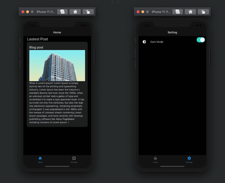
When we toggle the switch we change the theme of the entire app to dark mode and vice-versa.
We have successfully implemented the dark mode toggle in the React Native app. It was totally based on the Expo ecosystem using the Redux mechanism to handle the state of the theme.
Conclusion
This tutorial not only aimed to deliver the switching from dark to light mode themes. It also shared the basics used in the Redux state management configurations within React Native.
An essential part was setting up of dark mode theme switching. The switch was handled between the react-navigation components and react-native-paper packages.
However, the highlight of the entire tutorial was teaching readers how to use redux mechanisms to manage the theme state. Also using the reducers and action to control the state, and change the overall theme of the app.
Now, a challenge for you could be to use the same redux mechanisms to control other features in the application. Especially those features that are required to be handled globally. Some examples might be AdMob and offline connectivity features.
References:

Cloudzilla is FREE for React and Node.js projects


