

Building a Switchable Multi-Color Theme using React

Front-end developers face the task of making a user-interface that enhances user experience and accommodates user preferences. React.js with CSS can primarily be used to create a multi-color switchable theme.
The user is offered the privilege of toggling between theme colors to suit their preference at a given point in time.
Introduction
In this article, we will discuss the various steps and requirements to build a multi-color theme with React.js, CSS, and other dependencies.
Prerequisites
The reader should have prior experience with React.js, CSS, and any design library of their choice. If you are not comfortable with the aforementioned languages or frameworks, take a moment to understand the basics before proceeding.
Components of a theme handler in React.js
To achieve the goal of building a switchable multi-color theme, your web-application must possess the following components:
- Context Api for color State management
- Color picker components
- Navbar
- Sidebar
- Feeds
- Design dependencies for page elements.
Getting started with theme development with React.js
To maximize understanding, this tutorial will be structured in as a procedural format. The various steps required to complete the building of a switchable multi-color theme with react will be discussed as follows:
Step 1: Creating the React application
The first step in every react development is to create the react application. This step is easy to implement.
To create your react application, in the command terminal, run the command shown below:
npx create-react-app Demo-app
Or
Yarn create-react-app Demo-app
The command snippet above will create your react application, install the default development dependencies and finally provide a boilerplate to begin your app development with.
Step 2: Adding the required app dependencies
React.js ordinarily is capable of doing a lot of things, but adding some dependencies on top of it will provide a robust web development library, sufficient to handle numerous requirements.
For our project, we will install the following dependencies:
 "reactstrap": "8.7.1",
"semantic-ui-css": "^2.4.1",
"semantic-ui-react": "^2.0.3"
npm install
Step 3: Creating the theme context
State management in React can be done in two (2) ways, namely:
- React context API.
- React redux.
For simplicity we will use the former i.e. react context API. It will enable us to have real time monitoring of our theme component.
To set up our theme context, we create a ThemeContext.js file.
Then, we implement the code snippet below:
import React, {createContext, useState } from "react";

 const ThemeColors = {
  primary: "brown",
  blue: "blue",
  red: "red",
  purple: "purple",
  orange: "orange",
  green: "green"

};

 const ThemeColorContext = createContext({
  color: ThemeColors.blue,
  changeColor: (color) => {},
});

export default function ThemeColorWrapper(props) {
  const [color, setColor] = useState(ThemeColors.blue);

  function changeColor(color) {
    setColor(color);
  }

  return (
    <ThemeColorContext.Provider
      value={{ color: color, changeColor: changeColor }}
    >
      {props.children}
    </ThemeColorContext.Provider>
  );
}
We created a ThemeWrapper that will wrap all our components and provide the desired theme colors to the user.
The code block also created a react-context that holds six (6) colors which are:
- Brown
- Blue
- Red
- Purple
- Orange and
- Green
These colors will eventually become a part of our theme components.
Step 4: Creating the various components
Our Applications will have four (4) components namely:
- Theme-toggler
- Navbar
- Sidebar
- Feeds
We will now go ahead with the creation of our desired page components.
The theme-toggler component
The theme-toggler component will enable users to interact with the theme colors. An array of available colors will be displayed on a panel which the user will have to pick from and have the other components adapt to instantly.
To achieve this, we need to create a ThemeToggler.js file.
Then we proceed to the code snippet below:
import React from "react";
// importing the required reactstrap components
import { Dropdown, DropdownToggle, Badge } from "reactstrap";
import { ThemeColors } from "/ThemeColorContext";

function ThemeToggler(props) {
  const [dropdownOpen, setdropdownOpen] = React.useState(false);
  const handleClick = () => {
    setdropdownOpen(!dropdownOpen);
  };
  return (
    <div className="fixed-plugin">
      <Dropdown isOpen={dropdownOpen} toggle={handleClick}>
        <DropdownToggle tag="div">
          <i className="fa fa-cog fa-2x" />
        </DropdownToggle>
        <ul className="dropdown-menu show">
          <li className="header-title">SELECT THEME</li>
          <li className="adjustments-line">
            <div className="badge-colors text-center">
              <Badge
                color="primary"
                className={
                  props.bgColor === ThemeColors.primary ? "active" : ""
                }
                onClick={() => {
                  props.handleTheme(ThemeColors.primary);
                }}
              />{" "}
              <Badge
                color="info"
                className={
                  props.bgColor === ThemeColors.blue ? "active" : ""
                }
                onClick={() => {
                  props.handleTheme(ThemeColors.blue);
                }}
              />{" "}
              <Badge
                color="info"
                className={
                  props.bgColor === ThemeColors.purple ? "active" : ""
                }
                onClick={() => {
                  props.handleTheme(ThemeColors.purple);
                }}
              />{" "}
              <Badge
                color="info"
                className={
                  props.bgColor === ThemeColors.orange ? "active" : ""
                }
                onClick={() => {
                  props.handleTheme(ThemeColors.orange);
                }}
              />{" "}
              <Badge
                color="success"
                className={
                  props.bgColor === ThemeColors.green ? "active" : ""
                }
                onClick={() => {
                  props.handleTheme(ThemeColors.green);
                }}
              />{" "}
              <Badge
                color="success"
                className={
                  props.bgColor === ThemeColors.red ? "active" : ""
                }
                onClick={() => {
                  props.handleTheme(ThemeColors.red);
                }}
              />{" "}
            </div>
          </li>
        </ul>
      </Dropdown>
    </div>
  );
}

export default ThemeToggler;
We have successfully created a ThemeToggler with six colors visibly displaced on a color panel.

The Navbar components
Most modern websites usually have a navbar and ours will not be an exception. The navigation bar provides a brief summary of the website to the user and also facilitates routing.
Our Navbar component through the help of the theme-context will have color switching abilities which will be connected to the other components.
To create a Navbar component, we first need to create a Navbar.js file in the src folder then we implement the code snippet below:
import React from "react";
import classNames from "classnames";
// importing the required reactstrap components
import {
  Button,
  Collapse,
  DropdownToggle,
  DropdownMenu,
  DropdownItem,
  UncontrolledDropdown,
  InputGroup,
  NavbarBrand,
  Navbar,
  NavLink,
  Nav,
  Container,
  NavbarToggler,
} from "reactstrap";

function Navbar(props) {
  const [collapseOpen, setcollapseOpen] = React.useState(false);
   const toggleCollapse = () => {
     if (collapseOpen) {
       setcolor("navbar-transparent");
     } else {
       setcolor("bg-white");
     }
     setcollapseOpen(!collapseOpen);
   };
  return (
< ThemeColorContext.Consumer>
      {({ color }) => (

      <Navbar className=navbar-absolute" expand="lg">
        <Container fluid>
          <div className="navbar-wrapper">
            <div
              className="navbar-toggle", {
                toggled: props.sidebarOpened,
              })}
            >
              <NavbarToggler>
                <span className="navbar-toggler-bar bar1" />
                <span className="navbar-toggler-bar bar2" />
                <span className="navbar-toggler-bar bar3" />
              </NavbarToggler>
            </div>

            <NavbarBrand onClick={(e) => e.preventDefault()}>
              <div className="logo-img">
                <img
                  style={{ width: "5%" }}
                  src="https://images.pexels.com/photos/2235130/pexels-photo-2235130.jpeg?auto=compress&cs=tinysrgb&dpr=1&w=500"
                  alt="logo image"
                />
                Demo App
              </div>
            </NavbarBrand>
          </div>
          <NavbarToggler onClick={toggleCollapse}>
            <span className="navbar-toggler-bar navbar-kebab" />
            <span className="navbar-toggler-bar navbar-kebab" />
            <span className="navbar-toggler-bar navbar-kebab" />
          </NavbarToggler>
          <Collapse navbar isOpen={collapseOpen}>
            <Nav className="ml-auto" navbar>
              <InputGroup className="search-bar">
                <Button color="link" onClick={modalSearchToggle}>
                  <i className="tim-icons icon-zoom-split" />
                  <span className="d-lg-none d-md-block">Search</span>
                </Button>
              </InputGroup>

              <UncontrolledDropdown nav>
                <DropdownToggle
                  caret
                  color="default"
                  nav
                  onClick={(e) => e.preventDefault()}
                >
                  <div className="photo">
                    <img
                      alt="..."
                      src="https://images.pexels.com/photos/168938/pexels-photo-168938.jpeg?auto=compress&cs=tinysrgb&dpr=1&w=500"
                    />
                  </div>
                  <p className="lg-none" onClick={logout}>
                    Log out
                  </p>
                </DropdownToggle>
                <DropdownMenu className="dropdown-navbar" right tag="ul">
                  <NavLink tag="li">
                    <DropdownItem className="nav-item">Profile</DropdownItem>
                  </NavLink>
                  <NavLink tag="li">
                    <DropdownItem className="nav-item">Settings</DropdownItem>
                  </NavLink>
                  <DropdownItem divider tag="li" />
                  <NavLink tag="li">
                    <DropdownItem className="nav-item" onClick={logout}>
                      Log out
                    </DropdownItem>
                  </NavLink>
                </DropdownMenu>
              </UncontrolledDropdown>
              <li className="separator lg-none" />
            </Nav>
          </Collapse>
        </Container>
      </Navbar>
    )}
    </ ThemeColorContext.Consumer>
  );
}

export default Navbar;
From the code snippet above, we imported a lot of elements from the reactstrap dependency we installed in the beginning part of the article.
Those elements include:
- Button
- Drop-Down
- Collapse
- Container
- Nav-Links
- Navbar Toggler. Etc.
We also paced the various elements at appropriate positions on our Navbar awaiting styling. Feel free to customize them to your desired specifications. Then, we created a toggleCollapse function to handle toggling the Sidebar on small and medium screen sizes.

The sidebar components
The sidebar is also an important piece of a website, it plays an essential role in user interaction and in-app routing.
Our sidebar will be placed beside the Feeds component and will contain icons, texts, header and some links.
To create a Sidebar component, in your src folder, create a Sidebar.js file and which will accommodate the code snippet below:
import React from "react";
import { PropTypes } from "prop-types";
import { Icon} from "semantic-ui-react";
// importing the reactstrap components
import { Nav } from "reactstrap";
import { ThemeColorContext } from "/ ThemeColorContext ";
function Sidebar() {
    const sidebarRef = React.useRef(null);

const SidebarProps = ()=>{
  return(
    <div className=sidebar-props>
  <Icon className="side-icon" name={iconName} size="large" />
  <h2 style={{ paddingTop: "23px" }}>{title}</h2>
</div>
  )
}
  return (
    < ThemeColorContext.Consumer>
      {({ color }) => (
        <div className="sidebar" data={color}>
          <div className="sidebar-wrapper sidebar-container" ref={sidebarRef}>
           <div className="logo">
             <div className="logo-img">
               <img
                src="https://www.pexels.com/photo/white-and-blue-route-66-logo-1162361/"
                  alt="your logo"
                />
              </div>
              <h2 className="simple-text">Demo App</h2>
            </div>
            <Nav>
              <SidebarProps iconName="home" title="Home" />
              <SidebarProps iconName="globe" title="Explore" />
              <SidebarProps iconName="bell" title="Notifications" />
              <SidebarProps iconName="envelope" title="Messages" />
              <SidebarProps iconName="bookmark" title="Bookmark" />
              <SidebarProps iconName="user" title="Profile" />
            </Nav>
          </div>
        </div>
      )}
    </ ThemeColorContext.Consumer>
  );
}
export default Sidebar;
To simplify the job, we created a reusable SidebarProps component that accepts a sidebar icon and a text.
The following semantic-ui-react icons were used:
- Home
- Explore
- Notifications
- Message
- Bookmark and
- Profile
These icons provide the user with a clear view of the routes and component in our application.
We then wrapped our entire Sidebar component with the ThemeColorContext we created earlier to handle the theme-color of our sidebar.

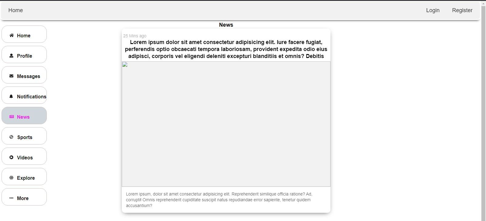
The feeds components
The feeds page in most cases is where web contents such as texts, images, icons, gifs, etc. can be found on the website.
We will create a Feeds component that will be displayed to the right of the Sidebar already created.
The Feeds will be kept simple with a few elements as it is not the focus of this article. Feel free to add and customize as many elements as you wish.
In our src folder, we created a new file Feeds.js, thereafter we can implement the code snippet below:
import React, { useState } from "react";
import { Avatar, Button, Card, Image, Modal } from "semantic-ui-react";

export function Feeds() {
  const [open, setOpen] = useState(false);
  return (
    <Card fluid className="post-card">
      <Card.Content>
        <div className="post-content">
          <div className="user-details">
            <Avatar src={profilePic} />
            <div className="timestamp">
              <div className="user-details">
                <div className="display-name-badge">
                  <h3>Slim Mike</h3>
                </div>
              </div>
              <Card.Meta className="post-time">35 mins ago</Card.Meta>
            </div>
          </div>
          <Card.Description className="post-body">
            <p>
              Lorem ipsum dolor sit amet consectetur adipisicing elit. Iure
              facere fugiat, perferendis optio obcaecati tempora laboriosam,
              provident expedita odio eius adipisci, corporis vel eligendi
              deleniti excepturi blanditiis et omnis? Debitis.
            </p>
          </Card.Description>
        </div>
        <Modal
          onClose={() => setOpen(false)}
          onOpen={() => setOpen(true)}
          open={open}
          size="tiny"
          trigger={
            <Image
              className="post-img"
              floated="right"
              size="large"
              src="https://images.pexels.com/photos/1478442/pexels-photo-1478442.jpeg?auto=compress&cs=tinysrgb&dpr=1&w=500"
            />
          }
        >
          <Modal.Content image>
            <Image
              size="massive"
              src="https://images.pexels.com/photos/1478442/pexels-photo-1478442.jpeg?auto=compress&cs=tinysrgb&dpr=1&w=500"
              wrapped
            />
          </Modal.Content>
        </Modal>
      </Card.Content>
      <Card.Content extra>
        <Button
          labelPosition="right"
          as="div"
          color="teal"
          basic
          content="Comment"
          icon="comments"
          label={{
            basic: true,
            color: "teal",
            pointing: null,
            content: 3,
          }}
        />
      </Card.Content>
    </Card>
  );
}
From the snippet above, we created a page similar to a social media news feed.
We also imported the following elements from semantic-ui-react:
- Avatar
- Modal
- Card
- Image
- Button
If correctly implemented, you should have a raw Feeds component ready for styling and viewing.
Step 5: Styling the various components
In the previous step we created a Navbar, Sidebar, and Feeds component. To improve the appearance and style of those components, we have to add the required styles.
To style our components, we create a styles.css file which will be used to customize our component.
The code snippet below should be implemented:
.navbar .navbar-wrapper {
  display: flex;
  align-items: center;
}
.navbar.navbar-absolute {
  position: absolute;
  z-index: 1050;
}
.navbar-toggler {
  padding: 0.25rem 0.75rem;
  font-size: 0.99925rem;
  line-height: 1;
  background-color: transparent;
  border: 0.0625rem solid transparent;
  border-radius: 0.25rem;
}
.search-bar {
  margin-left: 30px;
}
.search-bar .btn {
  margin: 0;
}
.logo-img {
  max-width: 55px;
  width: fit-content;
}
.search-bar.input-group {
  border-radius: 25px;
  z-index: 4;
  margin-bottom: 0;
  height: 43px;
  padding-right: 5px;
}
/* Sidebar styles */
.sidebar .sidebar-wrapper {
  width: 100%;
  min-height: 100%;
  max-height: calc(100vh - 705px);
  z-index: 4;
  position: relative;
  overflow: auto;
}
.simple-text {
  padding: 0.5rem 0;
  white-space: nowrap;
  color: #ffffff;
  font-weight: 400;
}
.sidebar-props {
  margin-top: 10px;
  height: fit-content;
  display: flex;
  padding-bottom: 5px;
  border: 1px solid #ccbcbc;
  border-radius: 20px;
  cursor: pointer;
  color: #1a1919;
}
.sidebar-props .icon {
  font-size: small !important;
}
.sidebar-props h2 {
  font-size: medium;
  font-weight: 600;
  margin-right: 20px;
}
/* Main page styles */
.post-card {
  margin: auto !important;
  width: 100% !important;
  background: #ecf3ff;
  height: fit-content !important;
  border-radius: 10px !important;
  padding-top: 10px !important;
  box-shadow: 0 5px 17px -7px rgba(0, 0, 0, 0.75) !important;
}
.user-details {
  display: flex;
  flex-direction: column;
  margin-right: 5px;
}
.post-time {
  padding-top: 4px;
}
.post-body {
  color: black !important;
  margin-left: 5%;
  font-size: medium;
}
.post-img {
  width: 100vw !important;
  max-height: 85vh !important;
  margin-left: 0 !important;
  overflow: hidden;
}
.timestamp {
  display: flex;
}
We have successfully styled our components with the code snippet above. The CSS snippet above provided numerous styles to all three components.
We achieved that by targeting the className assigned to each element.
Step 6: Displaying the components
In previous steps we created and styled the ThemeToggler, Navbar, Sidebar, and Feeds component.
We will move ahead with displaying our components in the App and then start our development server to view our Multi-Color Theme in our browser.
To do that, in our App.js file, we need to import our components as shown below:
import React from "react";
// our components
import Navbar from "/Navbar.js";
import "/styles.css";
import Sidebar from "/Sidebar.js";
import ThemeTogler from "/ThemeTogler.js";
import { ThemeColorContext } from "/ThemeColorContext";
function App() {
  return (
    <ThemeColorContext.Consumer>
      {({ color, changeColor }) => (
        <React.Fragment>
          <div className="wrapper">
            <div className="main-panel" data={color}>
              <Navbar />
            </div>
            <Sidebar />
          </div>
          <ThemeTogler bgColor={color} handleBgClick={changeColor} />
        </React.Fragment>
      )}
    </ThemeColorContext.Consumer>
  );
}
export default App;
Once the code snippet above is correctly implemented, the app component looks ready for viewing.
To view our application on a browser, open your command terminal and run the following command:
Npm:
npm start
Or for yarn users:
yarn start

You should be able to view the app on your browser once the development server starts.
Conclusion
In this article, we applied various concepts in creating a multi-color theme with React.js. We also looked at state management with react-context-api.
The concepts covered in this article can be used in future projects involving color and theme management.
I hope you find the content helpful in your programming endeavors.
Happy coding!
References
- https://codeburst.io/how-to-build-a-theme-switcher-in-react-330d7d81115d
- https://www.geeksforgeeks.org/how-to-add-theme-to-your-react-app/
Peer Review Contributions by: Monica Masae

Cloudzilla is FREE for React and Node.js projects


